
The Challenge
Research showed that a extremely large percentage of customers struggle to set up their internet service on their own. Our job was to design an optimized set up and activation flow using the upcoming XFINITY Internet app.
The nuances of this flow are immense. Whereas non ISP competitor products, such as Google's Onhub, can achieve a seamless two minute startup sequence, we were improving legacy technology that had to jump through multiple APIs to verify customer status, activate internet service, set WiFi info, as well as set up telephone service.
While the onboarding flow's happy path this straightforward, lots of logic exists to manage edge cases.
Our Approach
We started by distilling research from previous attempts to streamline the set up process into clear mandates per section.
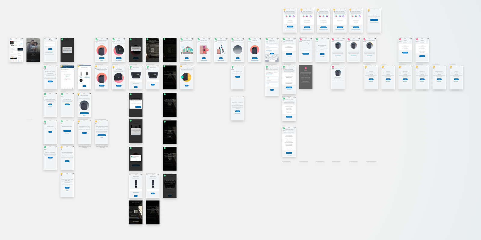
Next we developed a scalable set of patterns and dove right into creating wireframes to stress test our flows.
We then built and tested several prototypes with real activations in a research setting. These tests helped us to understand usability concerns and pinpoint moments where customers got lost in the process.


Messaging and Instructions
Arguably the most important goal of the flow was to quickly and easily communicate process and instructions to customers. Early research confirmed our assumption that while many customers appeared as though they were reading and comprehending instructions, when quizzed, key elements were missed completely.
To help combat this problem, we focused our efforts on creating engaging animations to visually communicate important concepts. By the end of the design process, nearly all screens could be understood entirely without reading.

Feedback and Loaders
Another goal of the project was to manage time customers spent waiting during setup. Previous to this effort customers were summarily disconnected from a temporary WiFi network without much notice. Many customers missed clear warnings, resulting in never actually joining their WiFi network. Instead, customers relied on LTE connections without their knowledge.
After a slew of low-fi prototypes, we added high fidelity animations to help sell in a panel based approach. A top panel showed traditional loader content, while helpful tip messages rotated in a carousel below. This approach tested well with customers, as it alleviated the impatience we observed when customers only had a looping gif to look at.
Given the constraints of the minimal progress information from our back-end APIs, this approach gave customers a sense of place, as well as primed them with a clear benefit to opt into push notifications: "We'll let you know when this is done!".

Results
The full onboarding experience has yet to roll out to customers outside of a limited trial, so results are still pending. However, this flow drastically improves on our existing flow, which fueled a dramatic drop in both setup time and complexity.
We are hopeful that with the help of new analytics, clear messaging and improved visual communication, we can continue to reduce the number of support calls received during setup.
My team is especially proud of this work, Together, these projects have pushed Comcast's overall design aesthetic towards a more pleasing illustration style, influenced how other teams apply onboarding patterns, had a substantial effect on customer call in rates, and customer satisfaction.