XFINITY TABLET
Your window to a more personal and helpful XFINITY universe
This project began as a thought experiment between our young UX team and our supervising executive. He was looking to explore ways to improve the entire XFINITY experience by giving out a tablet to customers. He asked us in a wonderfully open ended way, “If I gave every customer a tablet that came pre-loaded with an XFINITY suite, what could you do with it?"

A colored up wireframe
How can we increase our value in the home?
Like the job of a window washer, Comcast often only gets recognized whenever something breaks. As a result, the subtext for much of what my team does at Comcast can be obliquely defined as ‘creating more value’. When the question was asked, “could a tablet be a useful part of our experience?” within the larger Comcast service ecosystem, I leaped at the opportunity to illustrate at a more cohesive XFINITY service structure, in addition to trying to embody how a always-on tablet could become a focal point for a futuristic connected home vision.
Explore and research "the future"
I began this project by expanding my of knowledge concerning connected homes, machine learning, automated assistance in homes, prediction algorithms, industry trends etc… with a broad and diverse research phase.
Briefly, some of my research activities included:
- Understanding the XFINITY ecosystem with a service audit across our apps and customer life cycle.
- Exploring and documenting academic research pertaining to connected homes, robotic assistants, sensing activity within home environments, next gen geriatric technology, habit prediction, machine learning, rule mechanisms and related technology etc…
- Calling upon existing customer experience touchpoint audits.
- Revisiting internal demographic research trends and recommendations.
- Cataloging IoT devices emerging in the market with a competitive audit.
- Re-watching sci-fi depictions of home tech across the decades.
- Mapping a smart internet household.
- Consulting government and academic audits of home activity.
- Brainstorming new connected home concepts
- And more!
I summarized my evolved understanding in the form of a presentation that framed the world of the future in the form of several ‘new normal’ statements (see below).


Moment category synthesis (data via US Dept of Labor)

A home diagram I created to help portray specific user / device interactions
Identify customer needs and map our touchpoints
I distilled my research into a series of customer needs in the home to help frame future conversations and explore approaches to integrating a new home oriented device within peoples lifestyles. The larger Comcast UX team is a little idiosyncratic in its avoidance ofcustomer personas, so need states became a happy medium.

Need states in the home
Nevertheless, I still ranked our need states against some stock personas anyway to get a sense of hierarchy (below).

Screencap from a early need state analysis

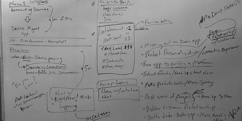
Brainstorm concepts and connect the dots
Armed with fresh need states and a mind full of research, I asked my colleagues to help me brainstorm concepts, rank ideas, and sort solutions by their apparent needs, feasibility, complexity, and awesomeness.
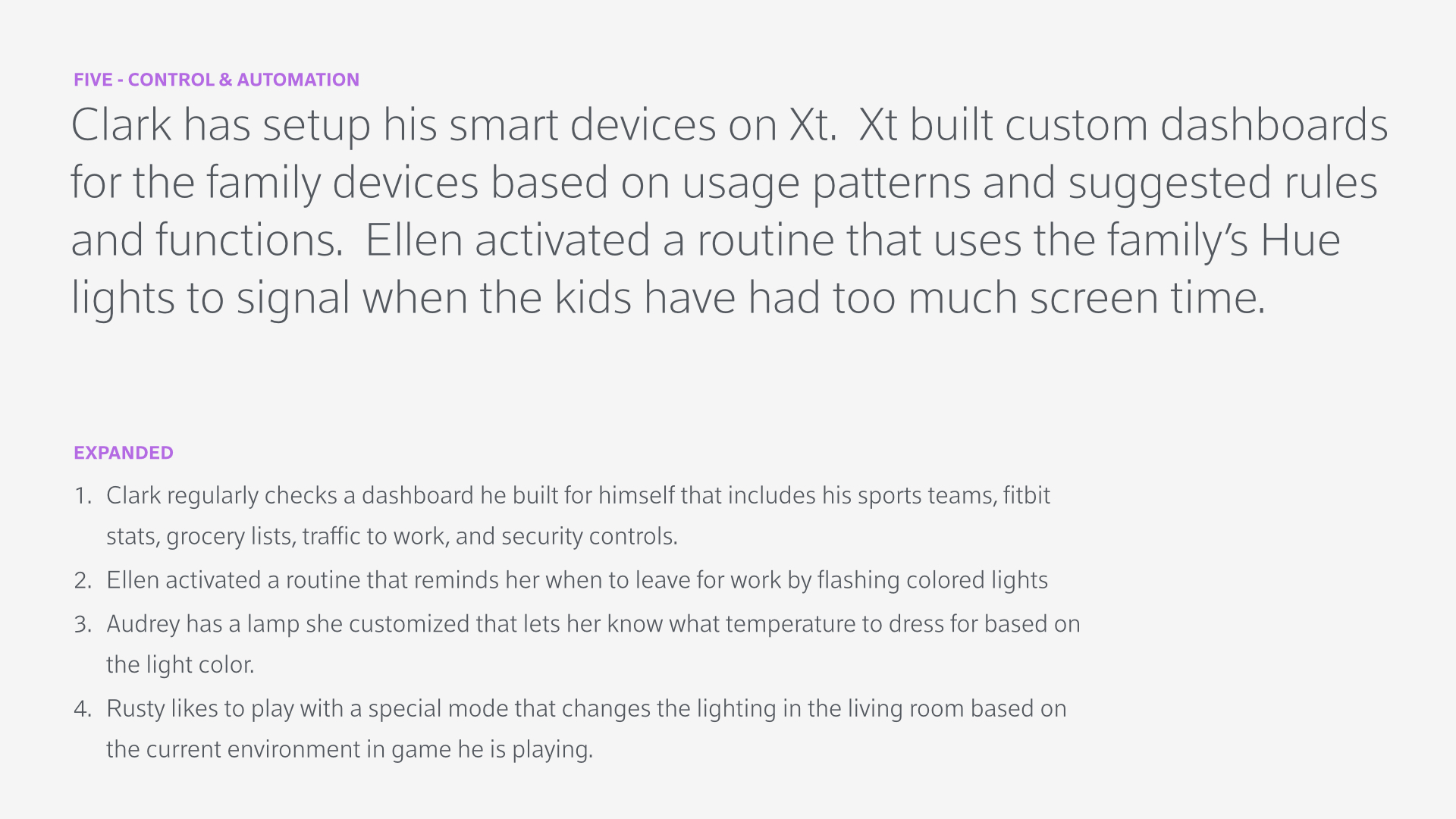
Refine the vision with scenarios
To further articulate potential use and inform my designs, I created a set of use case scenarios to flesh out our winning concepts in the context of a made up family unit. We evaluated our scenarios by asking seemingly obvious questions such as, “why would anyone do this?” and “does this make sense at all?” If a concept made it through our barrage of questions intact, I tried to include it in a more cohesive day in the life structure. Our scenarios were also grouped by service themes to help break up an otherwise quite long ‘day in the life’ story.
Our service themes:
- First time customer use and installation, where the tablet provided interactive assistance in on boarding and tech installation,
- Day to day interactions, where the tablet has earned a useful spot in the lifestyle of our family group.
- Troubleshooting, helping to resolve a service issue swiftly and efficiently.


Wireframe Sketches
Based on our scenarios I consolidated my sketches from earlier phases and quickly roughed out some preliminary block wires to show a few promising directions. Primarily I explored a dashboard type approach, where important contextually relevant information is displayed first, as well as an alternative layer cake approach. Other sketches explored how to integrate a type of lifestream feature with more utility oriented features such as an enhanced remote control for your television.


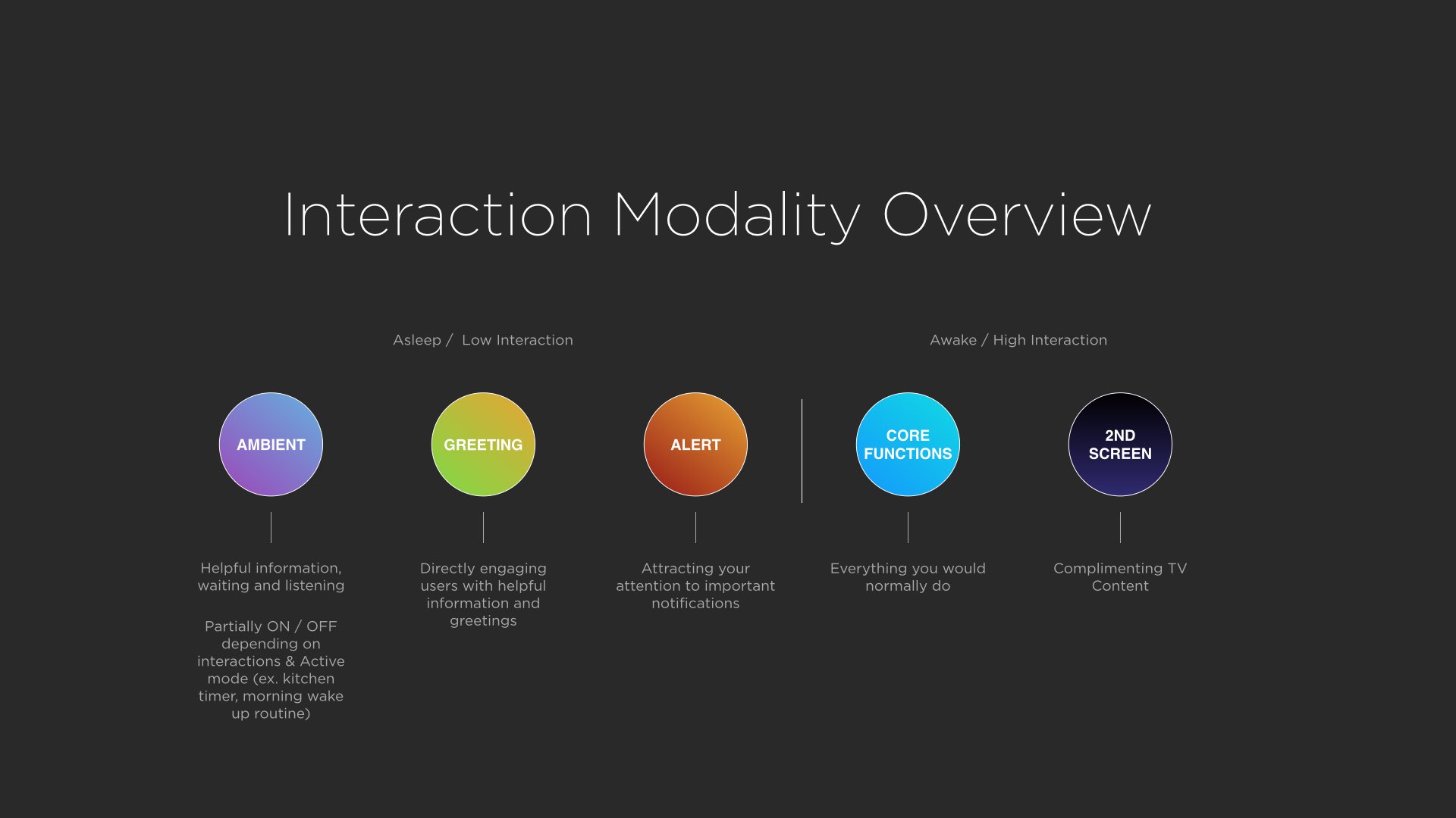
As with other projects, I spent a fair amount of time constructing and conveying organizational methods to help govern information architectures of particular approaches. This diagram outlines tablets modes given different levels and types of activity. Sometimes its fun to give slides large pretentious sounding titles :).
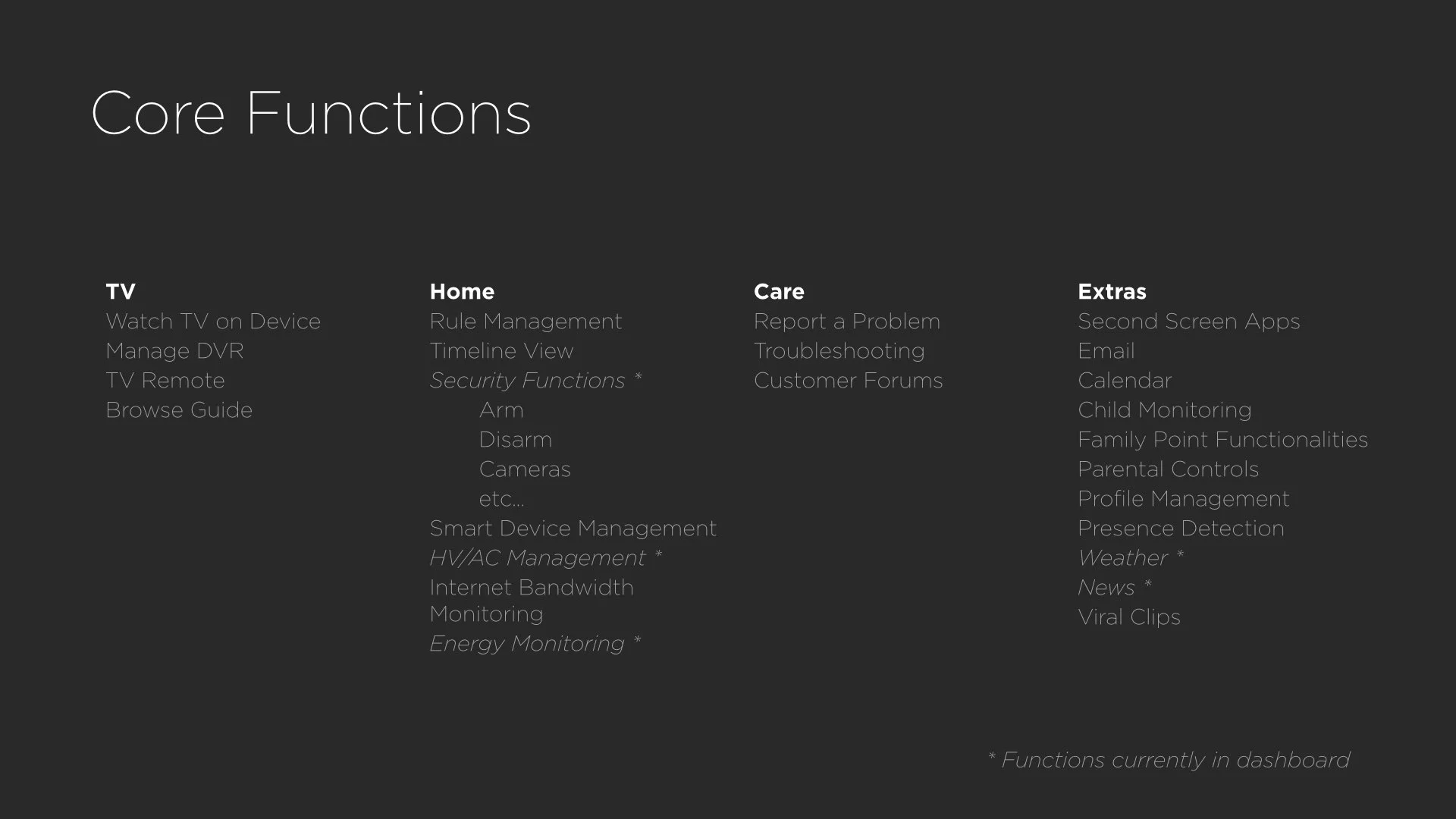


Additional IA exercises helped me to group and understand features and functionality. In lieu of a more formal feature functionality matrix, these organizational exercises helped me to shuffle features around and in turn convey said methods to members of the team who like to read lists and would otherwise get distracted with UI.


Block in content
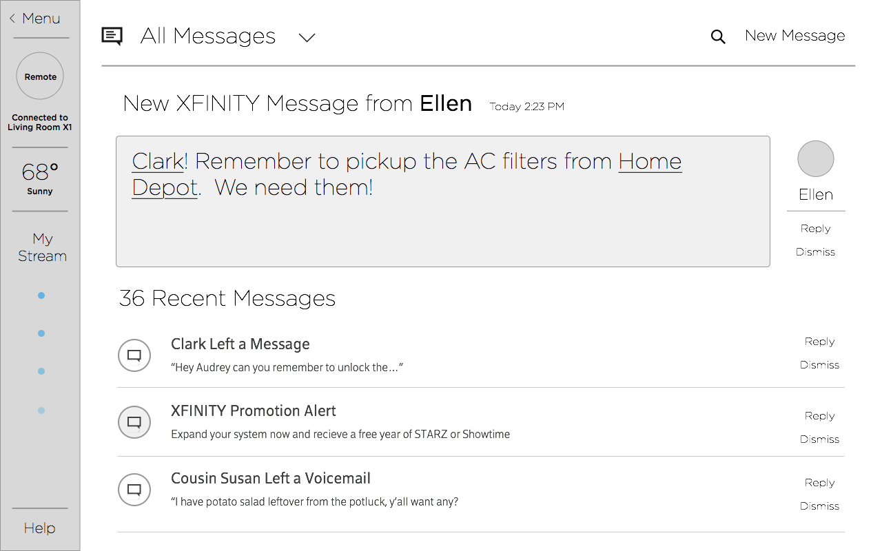
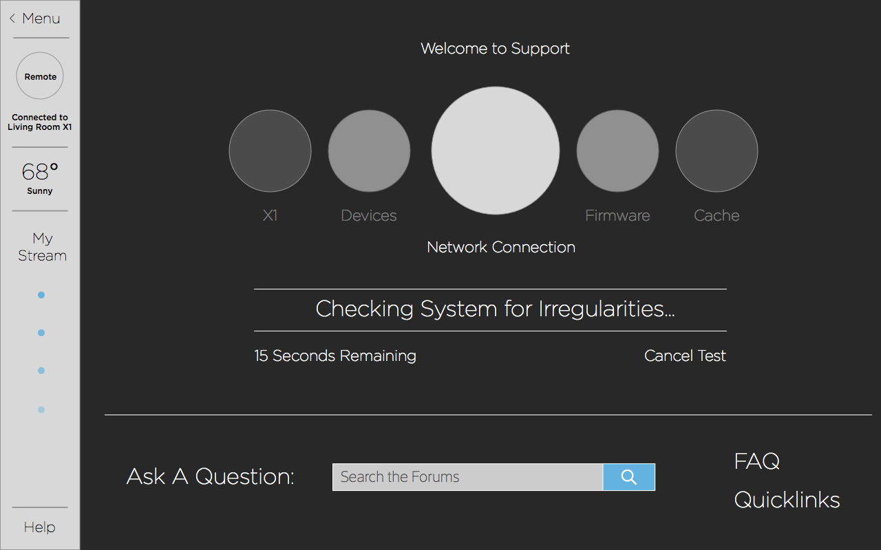
The only way to figure out if a layout works is of course to block in content. If at all possible I like to avoid lorem ipsum in my designs as I find that it often muddles first reactions. These exercises in manipulating content helped me to inflate and reduce framing of features to expose potential cracks in the system I was developing. Additional screens such as focused support oriented areas gave me a chance to try out some ideas from other colleagues and see if they fit.
Refine and rework
Initial tests were given more fidelity and tested against some menu experiments I had been kicking around. Generally if I continue with this kind of exploration I tend to switch to a more full featured prototyping environment such as Quartz Composer, but for this rather light menu experiment I found that Keynote did the trick.


Instead of tossing aside my layer cake and sidebar approaches, I found ways to incorporate their discrete functions into a final UI. You can also see where I began to make a political point by highlighting the complexity born out of Comcast's many apps. This full menu approach would potentially facilitate more Android like pin to home screen functionalities.
Results
With the days of working on a blue sky concept over for the moment, I packaged everything up, gave my UI some light (and rough) visual styling and presented the project to our boss. Over the course of a few months my work transformed into a long term agency contract to blow out the concept further. Many of the ideas I developed found their way into Comcast's support focused & TV apps, an XFINITY.com redesign, and future focused IoT concepts.


